Thumb-Zone Rule
No critical interaction can exist outside the natural sweep of a thumb on a 6-inch screen.
We have a physical stencil for this. If it doesn't fit, we redesign it.
We translate raw mechanics into player emotion through a disciplined, four-stage creative cycle. This is how we build apps that feel inevitable—crafted for performance, tuned for delight.
Our 12-page 'Alchemical Method' PDF, used by 200+ studios.
Our proprietary four-stage cycle transforms abstract concepts into tangible player emotion. It’s a laboratory process—measured, repeatable, and ruthlessly focused on feel.
Identifying the core emotional frequency (e.g., 'suspense,' 'flow') before any code is written.
Building 'paper-prototype' digital simulations to test if the feeling survives contact with logic.
Stripping visual noise until only the essential signal remains, ensuring 60fps on mid-range hardware.
A 3-week cycle of micro-adjustments to haptics, sound sync, and frame-perfect animations.
Premium isn't about adding features. It's about removing every element that distracts from the core experience. These are our non-negotiable laws.
No critical interaction can exist outside the natural sweep of a thumb on a 6-inch screen.
We have a physical stencil for this. If it doesn't fit, we redesign it.
Latency budget of <16ms for all haptic feedback loops. More breaks physicality.
This is non-negotiable. We sacrifice visual fidelity to meet this target.
1-hour session consumes ≤8% battery on standard devices.
We optimize assets offline and lazy-load non-essential elements.
User must understand game state within 2 seconds of waking the screen.
If it fails, we scrap the UI and start from a single, clean visual signal.
We strictly avoid hyper-realistic UI to prevent unsettling navigation.
Abstract shapes, not photos. Function over literalism.
If an animation exceeds 200kb, it is optimized or cut.
We use SVG masks and procedural generation to keep payloads lean.
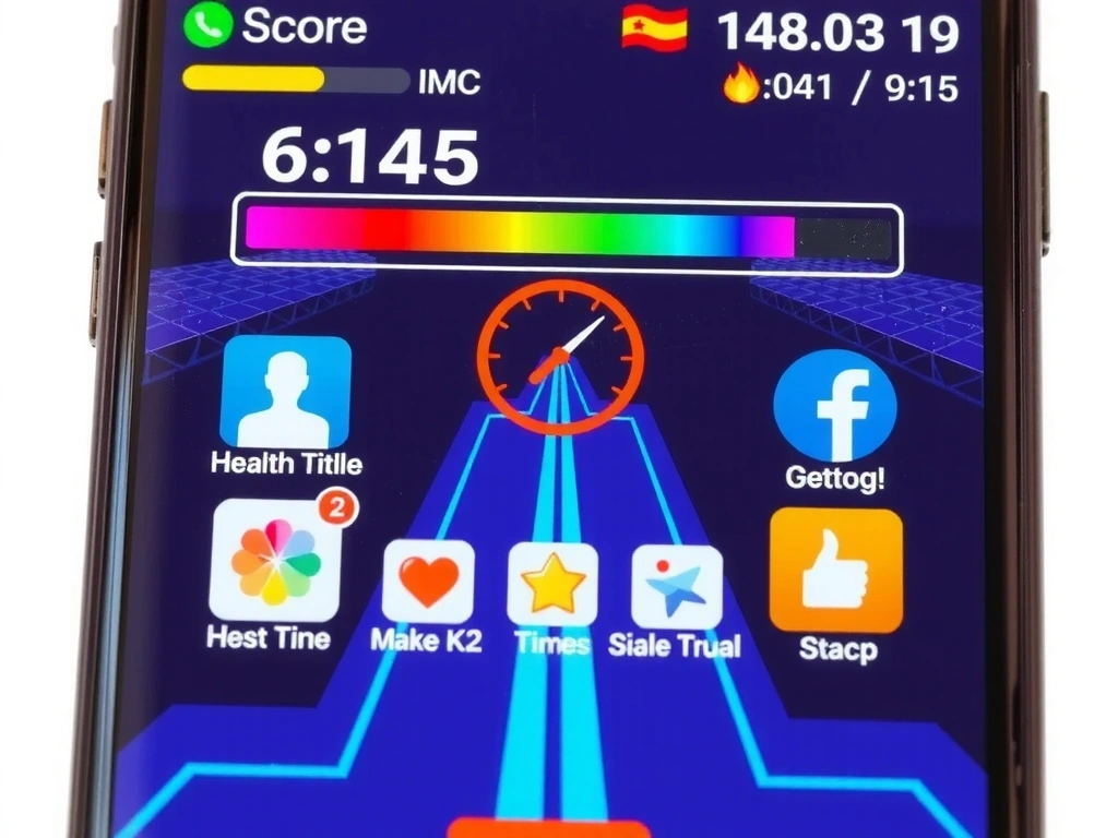
In our puzzle game Orbital, we made a radical choice: we removed the score counter entirely. The initial user feedback was panic. Players needed a number to validate their progress.
We replaced it with a dynamic color palette that shifted from deep indigo to luminous white based on success. Sessions weren't scored—they were performed.
"We don't design for the leaderboard; we design for the sigh of relief at the end of a level."
The Result: Retention data showed a 40% increase in session length. The 'anxiety of the number' was the real friction. By removing it, we created space for pure play.
Visualizing the 'Ghost' approach: from metric-driven to mood-driven design.
Our deliverables meet a 'Museum Grade' specification. This obsessive standard ensures every asset is future-proofed for emerging platforms.
Impact: This standard adds ~20% to production time but reduces post-launch bug reports by 60%.
We treat every asset as a museum piece—future-proofed for AR, VR, and print.
Our asset pipeline isn't about perfectionism; it's about risk mitigation. We evaluate robustness through three lenses: platform longevity, performance headroom, and emotional durability.
Platform Longevity: We ask: "Will this asset still render correctly in 5 years?" Working in P3 and at 4K answers 'yes' more often than sRGB and 1080p.
Performance Headroom: We don't target today's mid-range phones. We target the phone three years from now. This gives our assets a 20-30% performance buffer for future OS updates.
Emotional Durability: We test assets for 'visual fatigue' over 10-hour sessions. If a color or shape becomes annoying, it's cut. High-density, low-fatigue design is our goal.
An indie dev asks: "Why create 4K assets for a mobile game?" Our answer: When porting to Apple Vision Pro or a future Android tablet, you either own the master file or you pay for a remake. We choose to own it.
See the methodology in action. Explore our portfolio of shipped apps and deep dives.